Making the Cover Page for Rumi Book. What? How? and Why?
So far in our behind the scenes journey you've viewed snippets of the final pages, met multi-faceted researcher and member of the team Tanzil Rahman, and explored the process of selecting and illustrating the comics. What to explore now?Yes the wait is over. It is time now to reveal to you the illustration of the cover page!For this I delve into the creative mind of Rahil Mohsin to uncover the inspiration, symbolism and process behind the design of the cover page. I ask Rahil to share some of his artistic imagination and talent with us by revealing the illustration, the process of creating it, and the inspiration behind it.As always, the posts would not be complete without the sneak peeks just for you - so scroll down and enjoy as Rahil reveals all this: what, how and why?
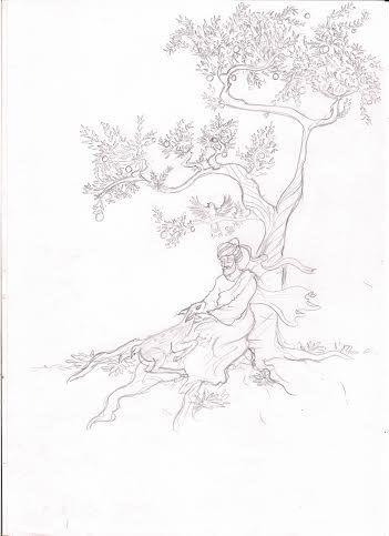
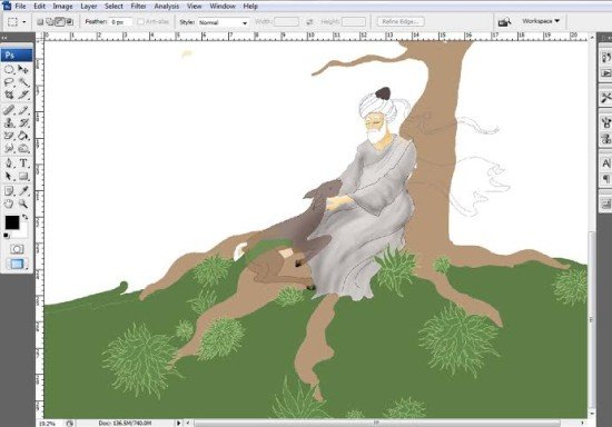
What is the process of creating the illustration? Can you share with us the rough/draft sketches?
Much to the chagrin of a lot of people I know, I am a purist. Most of my artworks, including the ones I’d done for Wise Fool of Baghdad and more recently, Rumi, are done by hand. Which means, the process of making an artwork is slower compared to work on a digital software (with all its fancy tools). That, and a mild doze of OCD. The processes I am talking about are the penciling and the inking stages (inside the book). Ali Bhai and Gaffur bhai bring life into the otherwise mundane and achromatic artwork by adding colours to them.While I’ve vehemently professed my love to the process that gets my hands stained with graphite and blackened by ink, there arehowever a few shortcomings when these hand-made art works are printed.Even if a small part of the said artwork is neglected (inspite of the OCD) and printed right away, the flaw, however small will stand out and ruin the artwork. I did not want to take such a huge risk while designing the cover page.I initially made a rough sketch of what I’d in my mind on a sheet of paper. Given below is a scanned copy of the sketch. The scanned picture was then uploaded on photoshop and the main characters were outlined using the brush tool.Similarly, other elements were also outlined while keeping in mind to place each element in a separate layer. Once that was done, I started filling in with a base coat. This is done to get a general sense of the whole composition in terms of colour balance.
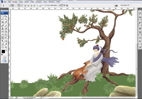
  The lighting was then determined and each element was shaded accordingly.
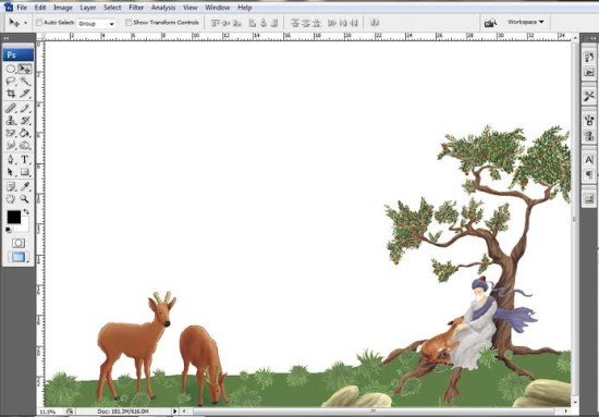
  As far as the cover page was concerned… piece of cake. The real challenge came when I began to design the back page. Initially one of the ideas was to put a border around the cover page and the back page would have separate elements. However, the idea was scrapped. The cover page design was then extended to the back page.
  And, to balance the composition, two deers were added.
Why this illustration? What was the inspiration/decision behind it?
When I first received the instructions to design the cover page for Rumi, I was told to design something that would summarize the book. The cover page should, in a way bring out a certain feel of peace and serenity – something that would soothe a viewer. Incidentally I was reading an article on Red Indian animal totems at http://www.spiritanimal.info/.It was here that I stumbled upon the significance of a deer totem. It said a deer totem stands for:• Gentleness• Ability to move through life and obstacles with grace• Being in touch with inner child, innocence• Being sensitive and intuitive• Vigilance, ability to change directions quickly• Magical ability to regenerate, being in touch with life’s mysteriesAnd I said to myself, aren’t these qualities in Rumi as well? Well it is true that this book contains stories narrated by Rumi with a deeper meaning but most important of all, they were a reflection of Rumi’s pureness and his selflessness.Hence I began designing the cover page showing Rumi calmly seated under a tree patting a fawn, representing his gentle nature. His shawl flowing in the wind’s direction signifying grace. The colour palette mostly consists of cool colours giving a soothing effect to the viewer.
What challenges did you face & how did you overcome them?
As mentioned earlier, as a purist, my biggest challenge was to make the cover page, in its entirety with the help of a software. Although, my hands weren’t stained by ink on its completion, I felt a certain sense of victory when I saw the final product. Another challenge faced was to make the cover page with certain elements from miniature paintings, like the tree in the background and the greenery, while at the sametime giving it a contemporary feel in order to make it more viable for a younger audience.
Have you read our previous updates on Sufi Comics: Rumi ?Stay tuned for another Rumi sneak peek coming soon!

